Pinkwater show reflects vision and teaching of Meredith Rosier
by Lynn Woods
Hudson Valley One
January 9, 2020
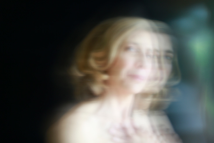
Meredith Rosier (photo by Joanne Savio)
“Marked Differences,” a show of abstract art by 34 artists at the Pinkwater Gallery, located in Uptown Kingston, is a tribute to the vision and teaching of Meredith Rosier, an artist based in Willow whose classes at the Woodstock School of Art (WSA) have spawned a movement. As yet nameless, the body of abstract work that’s blossoming in dozens of area studios mainly utilizes pastel and other dry media – though acrylic, watercolor, gouache and such unconventional materials as dirt, coffee and fireplace ash (which figures in much of Rosier’s own drawings) also contribute to the mix. It is characterized by certain qualities, even as it represents a range of styles: harmonic color; a vibrant energy, which even when it leans towards the contemplative infuses the work with a pulsing quality, like a heartbeat; a transparency of process, conveyed through layering and excavating the surface, a task that involves inventive mark-making; and an acknowledgment of the flat surface and its edges. In many cases that flat medium is paper, a substance that lends itself to a variety of surface effects and which Rosier, who is also an inspired and accomplished writer, describes variously on her Drawing Galaxy website as “an unceremonious vault of uncertainties…to which I headlong add logic and error” and “a great vacant estate…where I trawl for strategies.”
The result is a vigorous lyricism rich with emotion and sensation, predicated on experimentation and a commitment to the power of the imagination as a portal to the unique and expressive power of the self. In the exhibition statement, Rosier’s role is described as “revealing to the artist what one may have concealed even from oneself.”
The Drawing Galaxy, which Rosier launched in 2009, is a collective of 35 artists, most of whom are located in the Hudson Valley. The website showcases the work of each, along with upcoming events and exhibitions and a description by Rosier of an underlying “interdisciplinary methodology” in which science, literature, photography, pop culture and craft are interwoven with a technique of abstract drawing rooted in the automatism of the Surrealists. Many of these artists are featured in “Marked Differences,” along with a few of Rosier’s WSA students (she prefers to call them “explorers”).
All of the works evolved from blind drawings, according to Rosier, who gave this reporter a tour of the exhibition prior to its opening. (Also on hand was gallery owner Anne Sanger, who opened the capacious, brightly lit storefront space last September; an artist herself, Sanger is also a student of Rosier’s.) For example, the genesis of Susan Piperato’s stunning large pastel So on and So Forth was an instruction by Rosier to her students to close their eyes and draw forms resembling stringbeans from the top to the bottom of the paper, followed by the addition of smaller shapes and then some dotted lines. Piperato joined two sheets of 22-by-30-inch paper together in a vertical format to accommodate the long, skinny forms, which are both flat and volumetric, leaflike and pouchlike. The forms’ vivid palette of muted blues, purples, orange, greens and yellows, interspersed with white, which breaks up the mass, stands out from the ground of black and midnight blue, recalling the dramatic lighting of Dutch still lifes. There’s a sense of mystery about the dangling forms, as if they were a strange fruit, filled not with matter but with light.
Such instructions are designed to “give people a feeling for the material,” Rosier said. “They start with a composition and mature it.” She often plays music, making her own eclectic mixes of classical, world, hip hop, jazz – you name it – and begins a class by reviewing specific images from her extensive collection of art books. Regarding color, she might prompt the class or an individual artist to add “80 percent of a hot color, with the rest cold.”
Mary Lynne Bonforte’s small gouache-and-collage diptych, Tidal Wave, is a study in brilliant pink, which developed out of Rosier’s instruction to use the same color for each piece but vary the composition. The juxtaposition of pink with gold and cool, watery blue and the floating, cloudlike shapes suggest an Indian miniature, reinterpreted as a trippy fantasia of an alien sky or planet. Patti Gibbons’ Cha-Cha similarly plays with an illusionistic space, but in an entirely different manner: Her stacks of funky, curvaceous shapes, suggesting plants, rocks and body parts, reminiscent, with their cartoony dots and masses of color swarming with lines, of Guston and Picasso, swoon against the deep blue ground; their earthy yellows and siennas, complemented by touches of blue/green, suggest a Latin palette, a sizzling salsa. Scott Clugstone’s Audacious Torque, whose conglomeration of shapes sits more on the surface and snakes off the edge, juxtaposes irregular areas of blue, red, purple and dark gray with larger precincts of white, ranging from cream to pale gray, thickly applied; the pleasing, unusual effect is a surface texture that resembles a mosaic of opaque glass.
In a similar energetic mode, though more refined in the Gorkylike grace of its twisting arabesques, is Susanna Kearney’s Wild Series #6, in pastel, ink, colored pencil and acrylic. Writhing lines and shapes in dark orange, purple and blue emerge from depths of turquoise and black, while large areas of white – along the top edge, it shines like a flash of light – enable the piece to breathe. The title is apt: Rosier said that she told Kearney, who has a graphic design background and was “feeling things were constricted,” to “get wilder,” resulting in the series of which this piece is a part.
Picking a concept, in some cases reduced to a single word or phrase, and then creating a series of works around that theme is another of Rosier’s strategies. Doris Goldberg’s piece Hidden, in which thin veils of gray and dull-green paint semi-obscure a composition containing a red circle, blue grid and yellow squiggly form – inspired by a painting of children’s toys in the grass and chalk drawings washed away in the rain, according to a statement by the artist – is another example of this.
In stark contrast to the intense coloration and energetic, organic forms of these artists’ works are Michael Hopkins’ three small collages of faded, ripped paper and printed book pages, which express an understated lyricism: Washes of blue ink and accents of crisp black-and-white shapes suggest a rectilinear geometry, whose asymmetrical divisions and broken, tilted edges are both classically Modernist and airily spacious. John Kleinhans’ Ironbound, one of several works in black-and-white, is a rigorous conception of a metal frame within a frame, radiating lines and arcs, and a slinky, kitelike form or void, that utilizes rubbings, china marker and watercolor pencil to suggest both a machine and its motion. The speckled texture of the piece gives it the softness and patina of a lithograph, as if the drawing itself were the product of some mechanical process.
Two other standouts in this magnificent show are Jennifer Leighton’s 40-by-21-inch piece Without Apology, in which the interstices of a beautifully drawn composition of curved lines are tinted in a complex schema of yellows, reds, browns, greens and blues. The contrast of atmospheric color, enhanced in areas by stenciled dots, black lines and small, tightly compacted black shapes, clearly references Miró, while the rich interplay of color and swooping lines suggests Kandinsky’s symphonic, early non-objective compositions. Frank D’Astolfo’s pastel, conte and Cray-Pas Untitled both layers and flattens space: The pileup of yellow and sienna-colored amorphous shapes, fissured with white lines and topped by a gray/brown peak silhouetted against a muted lemon-yellow sky as if they were the geologic cross-section of a mountain, is both compressed and expansive, inert and in motion, unified and fragmented into pieces.
Prior to and during the tour of the exhibition, Rosier answered reporter Lynn Woods’ questions about her art and teaching:
Your work and teaching are based on abstraction –specifically, abstract drawing. What is the appeal of this?
Abstraction allows for invention, discovery and the evolution of new imagery that comes from an intangible interior dimension. There are no rules in abstraction, and that allows for an embrace of contradictory elements. The process is a mystery/poetical one rather than a logical one, and the unearthing is exhilarating.
I work mainly with dry materials, such as pastel, which is like working in a granular garden: The pastel can be very rough and crumbly, and also very velvety and smooth. As you layer it, it becomes like fur. It has an enormous capacity to have what I call a heartbeat, in the sense it feels alive when you look at it. The color has a vibrancy and coursing of life in it. I don’t start with a preconceived idea; the drawing just evolves. It’s a collaboration between myself, the material and whatever happens.
How does this approach translate into your teaching?
It becomes a collaboration between myself, the student and the work. It’s a catalytic process that creates its own energy. I can offer them ways to construct their own uniqueness through materials, tools and books I bring to class. Many times I will start someone who has not worked abstractly with a blind drawing. I might say, “Everyone please pick up two pencils in one hand and put down 12 small shapes, each different and each with a different line.” Then I would ask them to pick up their stump and put in three gigantic shapes with the dotted line. I walk around with a bottle of ground graphite, and everyone mashes their stump into the graphite so that the stump is covered with powder. When used in a drawing, it gives a soft smoky appearance rather than the sharp line of a graphite pencil.
I go through several different iterations, and then they open their eyes. Although everyone has done precisely what I said to do, each drawing is completely different. From there I will give an assignment. I might say, “I want you to work this drawing towards its maturity working with shallow space, deep space and middle space.” I will show them examples in books and teach them how to approach space. Each person is independent and has an inventive thinking process. I see them surprise themselves with the depth of their own brilliance.
This approach has earned you a loyal following.
I’ve seen some artists every Tuesday or Thursday for 11 years. I also have private students, from New York City to Albany. Some are working on exhibitions, some want a critique and some want to learn about new materials.
What are some unusual tools you suggest to your students?
Many kitchen tools are handy. For example, with a meat tenderizer you can pound paper on one side, and when you turn it over the surface is embossed. Sometimes I’ll have a class only on ripping, scraping and scratching, where excavation is primary. Also, toothpicks are good. I ask people to go to their basements and their toolshed to make what I call an Adventure Kit, which might include a metal wire brush and woodcarving implements. We work on various substrates, such as cardboard and cloth, which create a different avenue for drawing.
Where did you go to art school?
I had a full scholarship to Yale University, where I studied drawing. Then I received a full scholarship for my MFA from the Pennsylvania Academy of Fine Arts, which also offered me a housing stipend. It was there I had the fortune of meeting my mentor, Irving Petlin, who died last year. He took me into his family, which was a very joyous experience. I met my husband, Frank D’Astolfo, in New York City. We were married in 1997 in Central Park. He’s also an artist and was head of the Graphic Design program at Rutgers in Newark for 34 years. We bought our home here in Willow in 1999, where we share a studio.
You seem to work from a wide span of references. What else besides your art education contributed to this?
I’ve had mentors and participated in many residencies, including a year in Morocco at the Tangier American Legation Museum. Tangier is on the sea, so I started looking at the sea a lot and saw light in a different capacity. I was able to reach a depth of field in my tonalism I hadn’t had before – to feel light in a different way. I’ve also had residencies in France, Britain and the Vermont Studio School. Although I don’t draw from the landscape, I’m drawing from light or relative darkness in my internal landscapes.
What motivated you to start the Drawing Galaxy website?
Many artists need a place where their work could be shown online and in galleries, so I felt this was something that could be beneficial and valuable. Each artist has three images and a 100-word bio and a 100-word statement and pays $100 a year. Abstraction and a high degree of experimentation are the prerequisites, so they are continuing to evolve. It’s not a place to land, but to keep going. I’ve curated many shows, mostly in the area.
Words seem important to your work: Many of your drawings, for example, have a title consisting of a descriptive verb, such as “juggle,” “sidle” and “flounce.”
I write short articles and fiction. My heart quickens when I’m writing; it’s a physical sensation, the same way my heart quickens when I’m drawing. The transmission between the way I feel about words and putting them together in a sentence is similar to putting together shapes, color and line.
Often in my classes I give weekly homework. The homework might ask the artist to transmit three words into abstract drawings. Words have a posture, and transmitting this into line and color and shape is a fascination I’ve had my entire life.
“Marking Differences” features 34 voices, and all of them produce powerful work.
Every person has such a brilliance. For me to help them see this and surprise themselves is very rewarding. It’s really a moral enterprise, a process of discovery giving form to someone’s experience and relating it to their own culture. Incongruity, opposition and juxtaposition are contained in each of us, so the idea of imperfection and oddness is to be embraced. I’m offering someone a new look at themselves.
“Marked Differences,” through February 28, Saturday/Sunday, 11 a.m.-6 p.m., Pinkwater Gallery, 56 North Front St., Kingston; www.pinkwatergallery.com. For more information on Meredith Rosier, visit drawinggalaxy.com, meredithrosier.com or woodstockschoolofart.org. https://hudsonvalleyone.com/2020/01/09/pinkwater-show-reflects-vision-and-teaching-of-meredith-rosier/